
DevOps has become the backbone of modern software delivery. By breaking down the silos between development (dev) and operations (ops), DevOps teams can move faster, deploy more frequently, and maintain more reliable systems.
But with this need for speed comes the necessity of visibility. And this is where DevOps dashboards impress.
In this guide, we’ll cover the essentials of DevOps dashboards. This includes the key metrics to track, real-world use cases, and cost-aware design strategies that help you get more done with less.
What Is A DevOps Dashboard, And Who Is It For?
At its core, a DevOps dashboard is a centralized visual interface that pulls together key performance data across the entire development and operations lifecycle. Think of it as your single source of truth (or mission control) for everything from code deployments and system uptime to cloud usage and costs.
You’ll typically build a dashboard like this by integrating data from tools used across the CI/CD pipeline, infrastructure monitoring, logging, incident management, and more.
The goal? To help your teams quickly spot trends, catch issues early, and keep stakeholders in the loop. And all without jumping between tools or cobbling together manual reports.

Why Use A DevOps Dashboard?
DevOps moves fast. And a good dashboard can help your DevOps team keep up by offering:
- Real-time visibility: Whether it’s a spike in CPU usage or a failed deployment, your teams can see and respond to issues as they happen across your DevOps pipeline.
- Cross-team collaboration: Everyone, from developers to Site Reliability Engineers (SREs) to business leaders, gets to view and work from the same data, aligning around shared KPIs.
- Better decision-making: Dashboards surface patterns over time. This can help your DevOps team learn from experiences, anticipate and refine processes, and avoid reactive firefighting.
- Accountability and transparency: With metrics front and center, it’s easier to track performance, flag bottlenecks, and make data-driven improvements.
That said, the best DevOps dashboards share several key traits that make them indispensable as mission control for any high-performing team.
What are the central features of a good DevOps dashboard?
The most effective ones typically share these common capabilities:
- Customizability: Any teams relevant to the DevOps implementation should be able to tailor dashboards to focus on the metrics that matter most to their workflows. Take role-based views, for example. Developers, ops engineers, and executives often care about different things. So, a great dashboard offers filtered views based on these and more user roles.
- Tool integrations: Whichever DevOps automation tool you’re using (Jenkins, Prometheus, AWS CloudWatch, Datadog, or GitHub Actions), the dashboard should be able to pull in data seamlessly.
- Clear visualizations: Graphs, gauges, and charts should make trends obvious — not harder to spot or interpret. For example, critical issues are highlighted and ranked by priority, making it easier for teams to focus on what matters most.
It’s important to keep in mind, however, that not all DevOps dashboards serve the same purpose.
Types Of DevOps Dashboards: Determining Your Dashboard’s Focus
Depending on who’s looking at the data, and what they care about, you’ll need different types of dashboards to get the full picture. There are four common DevOps dashboards: operational, development, business-focused, and security dashboards.
Here’s a breakdown of each type and what it brings to your table.
1. Operational dashboards
These are the go-to dashboards for visualizing infrastructure and system health. Ops teams use them to monitor uptime, latency, server loads, traffic spikes, and incidents in real time.
Here’s what you can track here:
- CPU/memory utilization: Measures how much processing power and memory your infrastructure uses. The metric can help you identify overloaded systems or over-provisioned instances.
- Disk I/O and network traffic: Monitors how quickly data moves in and out of storage, or across the network, to spot performance bottlenecks.
- Service availability and response times: Tracks uptime and how fast services respond to requests. Tracking this metric is core to maintaining your SLAs and user experience.
- Incident alerts and logs: Flags anomalies, errors, or downtime events to help teams minimize time to repair an issue.
These operational metrics help ensure your systems run smoothly by enabling your team to spot anomalies before they impact the user experience.
2. Development (dev) dashboards
Built for engineers and DevOps practitioners, these dashboards focus on code-level activities and the CI/CD pipeline. Dev dashboards visualize how fast code moves from commit to production — and whether it’s breaking anything along the way.
Here’s how:
- Build/test pass rates: Shows the percentage of successful builds and tests in CI pipelines. They also indicate software quality and test coverage.
- Deployment frequency: Measures how often new code is pushed to production. The metric reflects delivery speed and team agility.
- Lead time for changes: Tracks the time between code commit and deployment. For example, a shorter lead time signals a more efficient DevOps workflow.
- Pull request velocity and review times: Visualizes how quickly PRs are opened, reviewed, and merged. You can use it to identify slowdowns in your development process.
With this level of visibility into a dev pipeline, your team can more easily spot bottlenecks. They can also help you identify where automation or process improvements could boost efficiency and optimize costs.
3. Business-focused DevOps dashboards
Executives like CTOs and CFOs don’t always need to see every infrastructure metric. But, they do want to know how DevOps performance impacts business outcomes. So, business-focused dashboards distill key metrics into insights that speak their language.
Here is what they track:
- Cost per deployment: Calculates the average cost of each release. Useful for understanding ROI on DevOps automation and tooling.
- Cost per feature: Helps track the efficiency of engineering efforts and where to improve cloud unit economics.
- Release frequency vs. business goals: Compares how often releases happen versus planned objectives.
- Cloud spend and budget burn rate: Monitors ongoing cloud costs against your budget, alerting you to potential overspending.
- ROI on DevOps initiatives: Analyzes the return from DevOps investments (tools, hiring, automation). See our guide on how to present cloud ROI to stakeholders like CFOs and the board for specific examples you can use right away.
This business approach to DevOps aligns technical performance with strategic business priorities. And this can help your team justify investments in tools, talent, or optimization initiatives and optimize costs at every stage of your DevOps lifecycle.
4. Security dashboards (DevSecOps)
Contrary to the traditional approach, security is no longer a post-release concern; it’s part of the DevOps pipeline.
Here is what that looks like:
- Vulnerability scan results: Shows known security issues in code, containers, or dependencies. You want to catch these as early as possible, too.
- Security test coverage in CI/CD: Indicates how much of your codebase is being tested for security flaws.
- Open security incidents: Lists unresolved threats or breaches. This ensures you know what needs work and how to prioritize remediation.
- Compliance check status (e.g., SOC 2, HIPAA): Tracks adherence to regulatory frameworks. The metric is handy for audits and proving trustworthiness to your customers.
Ultimately, a reliable DevSecOps dashboard can help your teams integrate security into their workflows. And this can translate to staying ahead of compliance requirements without compromising innovation or release cycles.
Key DevOps Metrics To Track On Your Dashboard
Once your DevOps dashboards are up and running, the next step is knowing what to track. Tools and team structures do vary, however, there’s a core set of metrics that apply to almost every DevOps environment.
You may have already seen a few of these metrics mentioned earlier, so in this section, we’ll look at the DORA metrics that matter most.
Deployment frequency
This DevOps KPI measures how often your team deploys code to production. A high deployment frequency signals a mature, agile DevOps practice — one that can deliver value to users safely, without long release cycles. It’s also a solid indicator of your team’s innovation velocity.
Lead time for changes
This indicates the time it takes your team to ensure committed code goes live in production. Shorter lead times can mean faster delivery and quicker feedback loops. The faster it is, the more positioned your engineering and product teams will be to adapt to user needs or market shifts.
Change failure rate
This DevOps metric tracks the percentage of deployments that cause failures in production. Think of outages, rollbacks, or incidents. Change failure rate reflects the reliability of your releases. If your change failure rate is high, it might signal a lack of automated testing, poor change control, or brittle infrastructure.
Mean Time to Recovery (MTTR)
This is a big deal in DevOps best practices. MTTR helps you track the average time it takes to restore service after a failure or outage. It is a measure of resilience. A low MTTR shows your team can respond quickly and effectively to problems, which directly improves user trust and business continuity.
Resource utilization
Here, the focus is on how efficiently your infrastructure resources (CPU, memory, and storage) are used. You can use the insight to identify over-provisioned environments or workloads running on oversized instances. This way, you can fine-tune performance while reducing cloud waste.
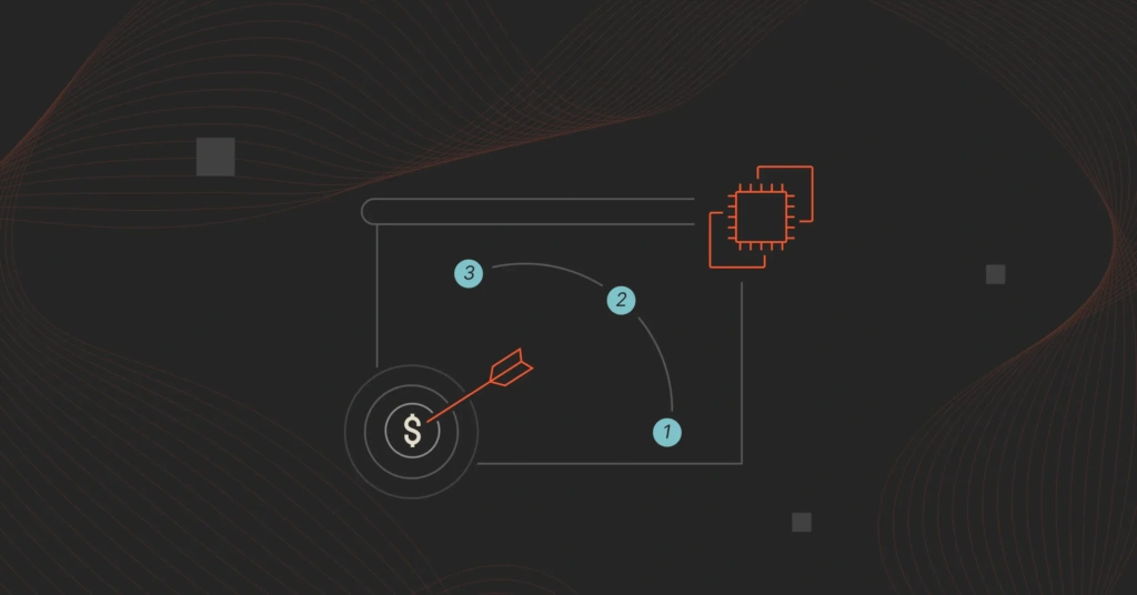
Cloud Costs
Cost transparency is essential for aligning DevOps and FinOps, especially in the cloud, where costs can spiral in seconds.
Also, note that this is not a single metric. It’s more of a collection of DevOps cost KPIs that help you track cloud infrastructure spend across services, environments, and teams.
The more granular the cost insights, the better. Take CloudZero’s cloud cost optimization platform for DevOps, as an example.
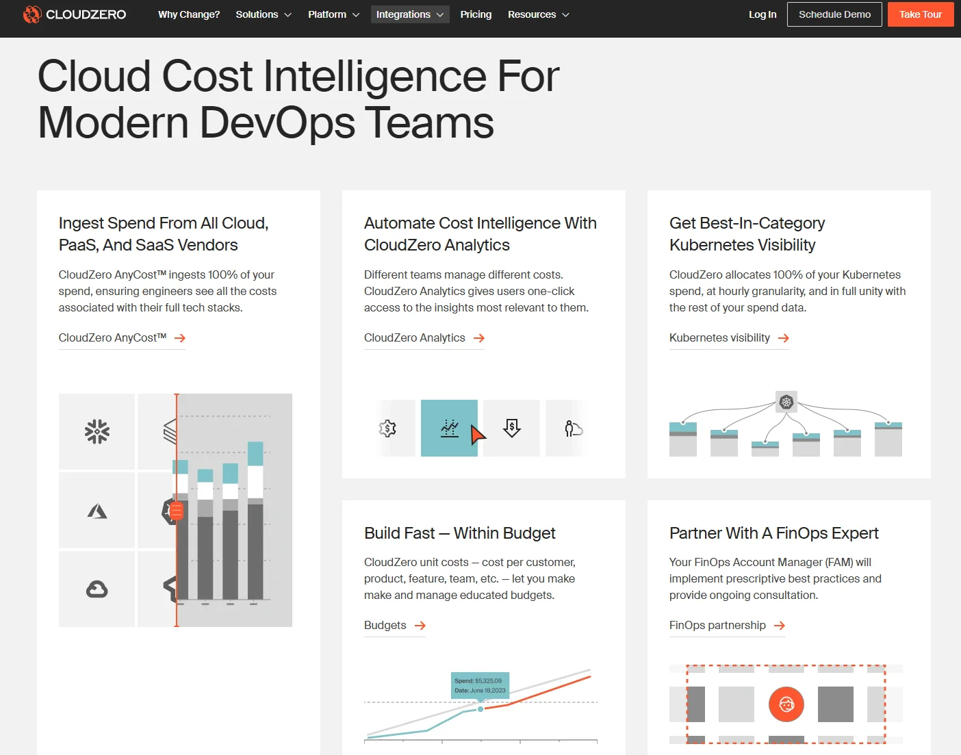
Instead of reporting only broad metrics, CloudZero provides more actionable data. This includes cost per customer, cost per team, and cost per deployment.

This helps you foster a cost-conscious culture, one where teams understand the financial impact of their architectural and operational decisions.
Even better, teams get hourly, actionable insights they need to build cost-effective solutions from the start, right at the architectural level, for long-term efficiency. Learn more about this Cloud Cost Intelligence approach with this free product tour of CloudZero.
5 DevOps Dashboard Examples
Whether you’re focused on stability, delivery speed, or cloud cost management, the right dashboards can help you take smarter, faster action.
Here are the most impactful use cases across the DevOps lifecycle:
1. Performance monitoring
This covers real-time visibility into system health by tracking key metrics like CPU load, latency, error rates, and response times.
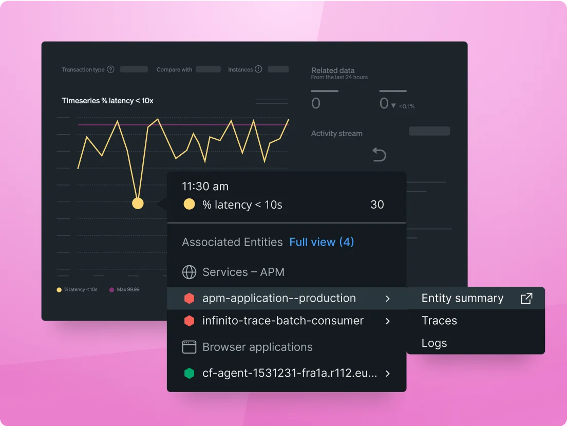
Example application performance monitoring (APM) dashboard for DevOps by New Relic
Monitoring performance enables engineering and operations teams to spot anomalies before they impact end users.
For instance, if memory usage spikes during a deployment, the dashboard can flag it immediately. This gives the team a chance to respond before it turns into a full-blown outage.
When integrated with alerting tools, dashboards can even trigger automated actions like scaling infrastructure or restarting services, reducing the need for manual intervention.
2. Incident management
Incident management dashboards act as a single source of truth, bringing together relevant logs, error messages, infrastructure metrics, and deployment history in one place.
Consider this example from ServiceNow:

This supports more effective post-mortems by providing the data teams need to understand what went wrong and how to prevent similar issues in the future — reinforcing continuous improvement, a core principle of DevOps.
This centralized visibility speeds up root cause analysis for outages or system issues to reduce mean time to recovery (MTTR). For example, if there’s a spike in failed HTTP requests following a recent deployment, that correlation can quickly identify a rollback candidate.
3. Continuous improvement
Over time, dashboards reveal patterns and trends that help teams fine-tune their pipelines and practices.
You might notice, for example, that pull requests in a certain repo consistently take longer to merge, or that test flakiness increases after a specific deployment stage.
With that visibility, you can make data-informed adjustments to workflows, tooling, or even team responsibilities to improve things.
Pro tip: Use tags and labels to group metrics by team, service, or feature for more granular insights into who and what needs optimization. Here’s an example in this CloudZero Resource Inventory dashboard:

4. DevOps cost optimization
In dynamic, auto-scaling environments, costs tend to escalate quickly. This type of dashboard combines resource utilization with cloud cost data. This approach helps your DevOps and FinOps teams spot wasteful patterns before they get out of hand.
For example, a staging environment running 24/7, even when idle, can be flagged and scheduled for automated shutdowns.
Your cost dashboard can also reveal when certain workloads would be more cost-effective running on Spot instances (short-lived, disruption-tolerant workloads) or right-sized Reserved Instances (more predictable workloads).
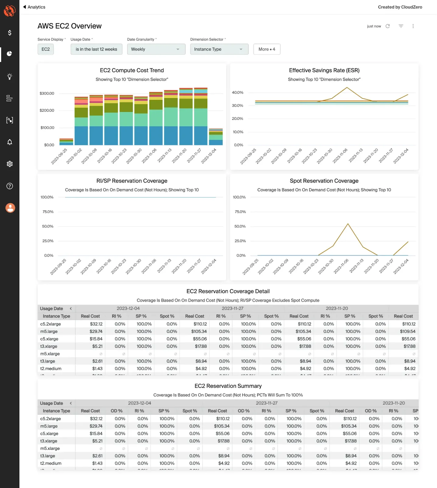
Example CloudZero AWS EC2 Overview dashboard
By tying cost data to deployment activity, teams can quickly see which workflows or environments drive costs and make informed changes.
5. Cloud Efficiency Rate (CER) dashboard
Cost-aware teams use the Cloud Efficiency Rate (CER) dashboard to measure the relationship between their company’s revenue and its cloud spend, expressed as a percentage. Consider this:

CloudZero’s Cloud Efficiency Rate dashboard
This metric shows how much of every dollar earned is retained after accounting for cloud costs. Tracking CER helps DevOps and FinOps teams assess profitability, uncover inefficiencies, and optimize cloud investments for a higher price-performance ratio.
How To Design Reliable DevOps Dashboards
A well-designed dashboard should be clear, purposeful, and tailored to the specific needs of its users. If it’s too cluttered, too generic, or misaligned with your business goals, it won’t provide real value.
Here’s how to design a dashboard that drives insight and action for your DevOps goals.
Align with business objectives
Start by identifying the goals behind your dashboard. Who will use it? What decisions should it help them make? You want a DevOps dashboard that connects day-to-day technical performance with broader business priorities.
- Developers want visibility into build failures, deployment frequency, and test coverage. From a cost perspective, they also want to track metrics like cost per deployment, cost per feature, and cost per team — so they can design and build cost-efficient solutions from the start. Read more about this Engineering-Led Optimization approach here.
- Ops teams need to see real-time system health, incident alerts, and resource usage. Actionable cost insights are just as important. Take cost per feature, for example. Your operations team can use it to assess whether a feature is financially sustainable as a free offering or if you need to move it to a paid tier to cover its operational costs.
- CTOs and CFOs are more interested in release velocity, infrastructure costs, margins, and ROI.
Tailoring dashboards to these needs will help your team focus on what matters most to the organization.
Choose the right dashboard tools for DevOps teams
Your choice of platform can also significantly affect its usability and adoption. The best dashboard tools integrate seamlessly with your DevOps stack and provide real-time, flexible visualizations.
Some popular options here include:
- Grafana or Kibana – Open-source, highly customizable, and great for real-time infrastructure monitoring.
- Datadog or New Relic – Commercial tools that offer powerful out-of-the-box integrations with modern DevOps environments.
- AWS CloudWatch, Azure Monitor, or Google Cloud Operations – These native tools suit teams that already use these cloud platforms heavily.
Also, look for DevOps dashboard tools that support:
- Role-based access: Lets you control who sees what based on their role, ensuring each team member gets a focused, relevant view without information overload.
- Real-time data streaming: Updates metrics as they happen, so your people can react swiftly to system changes, failures, or anomalies.
- Easy customization: Allows users to tailor dashboards without writing code, making it simple to adapt views as projects evolve or priorities shift.
- Clean, interactive UI: Ensures the dashboard is visually intuitive and easy to navigate, helping users explore data without friction or steep learning curves.
Here’s something else.
Customize the dashboard for different roles
One dashboard doesn’t fit all. Each team or stakeholder has different questions they want answered.
Here’s how that might look:
- Dev dashboards: Deployment frequency, build/test success rates, PR cycle time.
- Ops dashboards: System uptime, error rates, CPU/memory utilization, MTTR.
- Executive dashboards: Cloud spend trends, cost per deployment, ROI indicators.
Role-based views make dashboards more useful and ensure maximum adoption.
Focus on clarity and actionability
You want a dashboard that surfaces key insights at a glance, not one that buries them under noise.
Consider these must-haves:
- Uses simple, readable charts: Bar graphs, line charts, and gauges work better than complex multi-layered visualizations.
- Avoids clutter: Less is more. It prioritizes the five to 10 most important metrics per role.
- Highlights critical issues: It uses color coding or alert symbols to make problems stand out immediately. For example, it might use red to flag critical emergencies and orange for important, but less urgent, issues.
- Tells a story: You want one that organizes DevOps metrics logically to help your users quickly understand trends, relationships, and what action they need to take.
Get Real-Time DevOps Monitoring With Cloud Cost Intelligence
A well-designed DevOps dashboard is like mission control for your entire software lifecycle. It pulls data from multiple tools and environments to give you a clear, real-time view of what’s happening across the pipeline.
But the best dashboards do more than monitor technical performance. They’re also powerful tools for cost optimization.
Yet, visibility alone isn’t enough. You need a dashboard that helps you turn data into action. And that’s where CloudZero’s Cloud Cost Intelligence dashboards come in.
With CloudZero:
- Engineering teams can monitor cloud costs just like any other DevOps metric — right alongside usage, deployments, and performance.
- Finance and FinOps teams gain instantly actionable insights, such as cost per customer, and can pinpoint who and what affects costs and why, without slowing down engineering velocity.
- CFOs can align finance and engineering teams around cost-effective solutions that support long-term business efficiency.
- CTOs can empower engineers to minimize surprise cloud costs without compromising innovation, experimentation, or user experience.
- The board gets the financial intel to make cost-conscious strategic decisions — both short-term and long-term — with confidence.
Innovative teams at companies like Coinbase and Upstart already use the CloudZero approach. And we just helped Upstart save $20 million. Ready to take the guesswork out of your DevOps cloud cost optimization?  and see the difference for yourself.


The Cloud Cost Playbook
The step-by-step guide to cost maturity